Sunnidale Wellness came to SPARK looking for a complete brand identity for their counselling and psychotherapy business. Using my knowledge of colour theory, logo design and font choice I helped them communicate their company values through a cohesive visual system.
Sunnidale’s goal with this project was to craft a unique look and feel that would quickly signal to new clients who they are and what they offer.
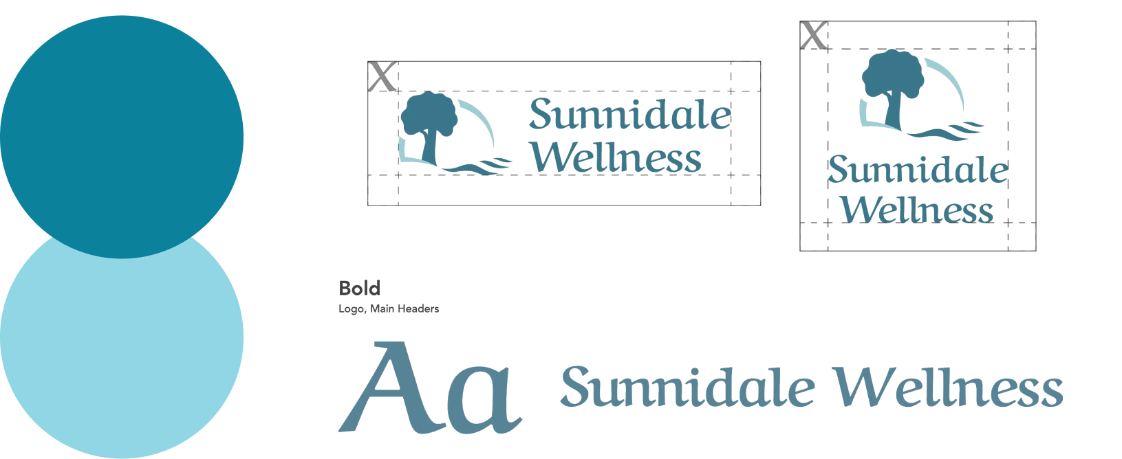
I designed a simple landscape symbol that can be interpreted literally as their namesake, and included essential elements that hold deeper symbolic meanings. The tree denotes growth, reliability and trustworthiness while the river was used to convey the calm feelings and healing properties associated with water.
Finally, an arc was used to represent the sun and balance the overall shape of the logo. On a physical level, the sun represents warmth and life, but in many cultures the sun also represents psychological growth, making it a powerful metaphor for Sunnidale’s services.

Blue-green is commonly associated with healing because of its blend of colours found in nature; green healing herbs and cool refreshing water. This colour combination is so effective, it’s commonly seen in hospitals and clinics to create an atmosphere of comfort. Since dark blues are often used to convey integrity, a darker shade of teal was added to compliment the primary colour and message.
As for the wordmark, I discovered that Aref Ruqaa’s letterforms have soft, upturned serifs that resemble waves of water. This subtle detail worked perfectly to reinforce the soothing river motif without sacrificing legibility or drawing attention away from the logo symbol.